Today was an audaciously AWESOME spring day. Everything about it was PERFECT, perfect enough to sit out on the patio and do nothing but savor being alive. Sun on my skin, breeze in my hair, birds chirping, garden starting to pop…what more could you ask…
It was a day for landscapes. These are from my iPad. Studies for paintings? Prints? What do you think?
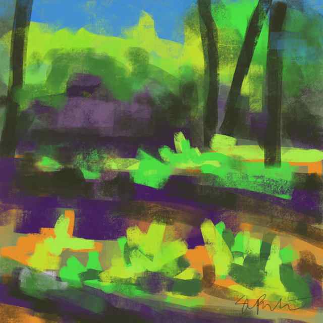
I did this one today. Plein aire ipad. The sun and the shadows were intense, emboldened me. This piece has a totally different feel than the one I made yesterday (arrow pointing down).
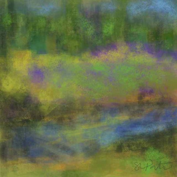
This was from a photo I’d taken a few years ago of a nearby meadow (not my meadow). The photo was washed out and I think that influenced how I approached the painting. I remember the sky and pond in real life as being quite blue. The Scotch Broom was in bloom, bright yellow and the meadow was thick with purple lupines. I think I’ll do this one again in the style of the first just to see how it comes out. Check back next week and see.
Do you have a favorite? I’d love to know…we’ll call it market research. Let me know in the comments below.
Until next week–


I really like them both, but the bottom one is evocative of Monet’s studies of his gardens…which appeals to me. I like the Colors in that one best and the composition of the first one better.
I may switch them both up, Susie, just because…. It’s easy enough to do with an ipad. Then perhaps I’ll use them as the basis for paintings.
I agree about the color. If the top one was toned down just a bit. Think it’s because I was influenced by the intensity of the light.
Love the meadow and pond – the combination of soft greens and purples. And – may I ask what painting app you’re using? I’ve been playing around myself lately…curious to learn more.
I’m using procreate, Marcie. It’s a robust platform that supports large files for printing. A little bit of a learning curve and some occasional glitches but well worth the time to figure it out. They also have a downloadable manual on their website as well as an engaged support community in the forum.
I am drawn to the one on the bottom. It seems less forced, less “painterly” to me. Does that make sense?
Kelly L McKenzie recently posted..Still Blossoming at 91
Makes perfect sense, Kelly. It’s a totally different feel than the top one, as Susie M says, more Monet-like. I’m still finding my voice when it comes to landscapes so all this info is good for me to take in. Thanks!
I like both paintings. The bold strokes and colors of the first painting give me a feeling of something fresh and alive…spring bursting out after an afternoon thunderstorm! The softer more muted tones of the second painting are calming, soothing and meditative. Both certainly have their place! Beautiful!
Debbie Goode recently posted..Buster 5
Thanks, Debbie I agree, they both have their place. The top one certainly has more energy. I’ve done a number of landscapes in oils and acrylics more in the style of the bottom one. I feel like I’m busting out with the top one. THink I’ll try a palette knife version next 🙂
I can’t wait to see your palette knife version! These are both beautiful but I particularly love the iPad version (thanks for sharing the app with us) Can’t wait to see more!
Rebekah Nemethy recently posted..Reflections of an Artist: Fine Art Photography with a Splash of Prose (10) – Drowning the Garden
They’re both iPad, Rebekah, Both using the same app and same ‘brush’ as well except on the first (top) one I bumped up the opacity and bumped down the brush size. The bottom one was done using a wider, more transparent stroke–many of them overlayed.
Hey Susan, I’m loving the the second one on the bottom. I’m drawn to the softer, ethereal feel I get. Love what you are doing on the ipad.
It’s more like a watercolor, isn’t it Sue. If you like that style you’ll have to check out my website when I get my inventory up, lots of that sort of look.
If I chose I would say I love the first one, Garden View from the patio. The bright colours had me smiling and ready to burst out into nature.
Karen Main recently posted..The Incredible Gift of Listening.
That’s how I feel about that one, Karen. It was an in-your-face bright spring day, even more so because we had snow a few days earlier. Such a fickle time of year but the garden keeps growing 🙂
I don’t yet have a favorite, because I love them both. But I am eager to know if these will become studies for other paintings (digital or otherwise). I love seeing what you create!
Harmony Harrison recently posted..The Great Corgi Leap! In which real paint is put on real paper. Really.
Right now I consider them to be studies, Harmony. I’m eager to try my hand on the first one with oils or acrylics. Should have something to show next week. 🙂
Exciting!
Harmony Harrison recently posted..The Great Corgi Leap! In which real paint is put on real paper. Really.
Meadow with Pond is beautiful. I could look it at for hours. Serene bliss. Love the way it makes me feel! Bravo
One of my collectors told me my art takes her ‘where she needs to go’. I guess Meadow with Pond is taking you there, Debbie 🙂
Oh I love how different these are. And I really can’t pick a favorite – I feel like I’m stepping into a different experience with each that I love. Yay for the inspiration of beautiful Spring days!
Deborah Weber recently posted..Robin Bobbin’
YAY indeed, Deborah! I LOVE spring! We finally landscaped last year and watching the garden unfold a little bit more everyday is magical.